> ## Documentation Index
> Fetch the complete documentation index at: https://docs.figr.design/llms.txt
> Use this file to discover all available pages before exploring further.
# Prototype
> Generate production-ready UI designs that match your product. Not generic templates. Actual interfaces you can show stakeholders and export to Figma.
## What Prototype Does
Prototype is Figr's core design generation capability. Describe what you need, and Figr creates high-fidelity interfaces based on your product context, design language, and memory. Prototype generates:
* Complete screen designs
* Component layouts
* Multi-screen flows
* Responsive variations
* Interactive states
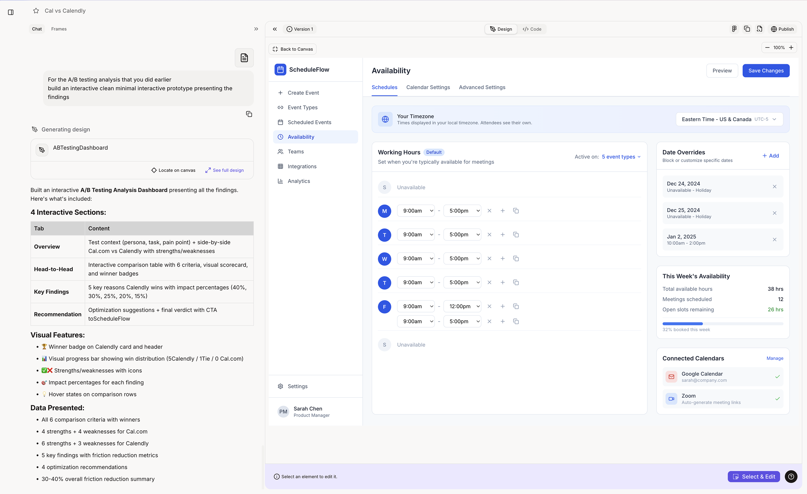 ## [](#when-figr-uses-prototype)When Figr Uses Prototype
Figr automatically engages prototype generation when you:
* Ask for a new screen or page design
* Request a feature interface
* Need UI for a specific flow
* Want to visualize a concept
* Ask for design variations
```text theme={null}
"Design a settings page"
"Create a dashboard for analytics"
"Build a checkout flow"
"Show me what a notification center could look like"
"Design the onboarding experience"
```
***
## [](#what-you-get)What You Get
Not wireframes. Not sketches. Production-ready designs. Output includes:
* Correct colors from your design language
* Proper typography and spacing
* Real component patterns
* Realistic placeholder content
* Complete visual hierarchy
Prototypes look like they belong in your product. Figr applies:
* Your design system tokens
* Your component patterns
* Your layout conventions
* Your visual style
* Context from memory
Take designs directly to Figma or code. Export options:
* One-click Figma export
* Code export for development
* Image downloads
* Share links for stakeholders
***
## [](#best-results)Getting Best Results
* **Less effective:** "Design a dashboard"
* **More effective:** "Design a dashboard showing: daily active users chart, recent activity feed, and quick action buttons for creating new projects"
* **Leverage your context:** "Using our existing card style, design..." "Match the navigation from our dashboard..." "Follow the form pattern we use in settings..."
* \*\*Request complete coverage: \*\*"Design the empty state, loading state, and populated state" "Show mobile and desktop versions" "Include error handling for failed submissions"
## [](#when-figr-uses-prototype)When Figr Uses Prototype
Figr automatically engages prototype generation when you:
* Ask for a new screen or page design
* Request a feature interface
* Need UI for a specific flow
* Want to visualize a concept
* Ask for design variations
```text theme={null}
"Design a settings page"
"Create a dashboard for analytics"
"Build a checkout flow"
"Show me what a notification center could look like"
"Design the onboarding experience"
```
***
## [](#what-you-get)What You Get
Not wireframes. Not sketches. Production-ready designs. Output includes:
* Correct colors from your design language
* Proper typography and spacing
* Real component patterns
* Realistic placeholder content
* Complete visual hierarchy
Prototypes look like they belong in your product. Figr applies:
* Your design system tokens
* Your component patterns
* Your layout conventions
* Your visual style
* Context from memory
Take designs directly to Figma or code. Export options:
* One-click Figma export
* Code export for development
* Image downloads
* Share links for stakeholders
***
## [](#best-results)Getting Best Results
* **Less effective:** "Design a dashboard"
* **More effective:** "Design a dashboard showing: daily active users chart, recent activity feed, and quick action buttons for creating new projects"
* **Leverage your context:** "Using our existing card style, design..." "Match the navigation from our dashboard..." "Follow the form pattern we use in settings..."
* \*\*Request complete coverage: \*\*"Design the empty state, loading state, and populated state" "Show mobile and desktop versions" "Include error handling for failed submissions"